Chapter 12 Spatial Statistics
One of the most powerful ways I use and present data is to explain spatial patterns in our data. How does a product perform in Ohio versus Iowa? What might be the underlying weather or soil causes of these data? How do they vary with geography?
Quantitative data and hard numbers are fantastic. But as we have already seed with plots, visualizations can be much more engaging. Our minds are evolved to recognize patterns – in fact, we are so focused on looking for patterns that we need tools like statistics to keep us honest. So a statistics-based plot or map is a very powerful way to convey information to your audience or customers.
This is a one of two brand-new units in Agronomy 513. You might not think a statistics software like R might be equipped to work with spatial data, especially after spending the first 11 weeks working with some ugly code. But R can readily work with shape files and rasters (think of a fertilizer application map), both creating and analyzing them. We will learn how to overlay polygons to relate soil to yield, and how to create a application map based on gridded soil tests.
This unit will be light on calculations (yea!) and focus more on three key areas. First, what is projection and why do we need to worry about it if all we want to do is draw a map or average some data?
Second, what is a shapefile? How do we make sure it’s projection is correct for our analyses and for joining with other shapefiles? How can layer the shapefile data with soil survey data readily accessible through R? How can we create an attractive map with our shapefile data?
Finally, we will study rasters. Rasters organize data in grids of cells that are of equal dimensions. Using point data from a shapefile, we can use tools like kriging to interpolate (predict) the value of each cell in the raster, creating another kind of map we can use to understand spatial data trends.
12.1 Projection (General)
One of the most challenging concepts for me when I began working with spatial data was projection. To be honest, it is still is a challenging concept for me! Projection describes how we represent points on the surface of the earth, which is spheroidal, using maps, which are flat.
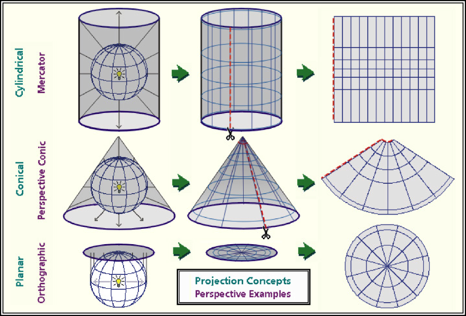
As we can see in the figure above, projection differ in how they are positioned relative to the earth’s surface. Some are positioned relative to the equator, others might be centered between the equator and the poles, while yet others may be positioned at the poles. Each map will represent the center of it’s geography better than the edges.
Each map is a compromise between the representation of boundaries (positions on the earth’s surface) and the areas within those boundaries. Maps that pursue the accurate representation of boundaries on the earth’s surface are going to end up distorting the area of geographies outside the focal point of the map. Maps that accurately represent areas are going to distort the position of geographic boundaries on the earth`s surface. Thus, there are hundreds of differet projection systems, focused on different areas of the earth, and using different units to describe the position of boarders.
“Whoa, Marin”, you may be thinking. “I’m not trying to represent the world, the United States, Minnesota, or even my county! It’s just a freaking yield map!” And you would be absolutely correct: none of these projection systems are going to vary much in how they represent the location or area of a single section of land.
But, in working with spatial data from that field, you will encounter differences among systems in how they locate your field on the face of the earth. Therefore, it is important we look at a few examples so you understand how to process those data.
We will start in the lower corner with WGS 84. This is the geographic system with which most of you are probably familiar. It is also how I roll with most of my analyses. It’s simplistic, but it works just fine for point geographies – that is, single points on the earth’s surface.
12.1.1 WGS 84 (EPSG: 4236)
WGS 84 refers to “World Geodetic System”; 84 refers to 1984, the latest (!) revision of this system. WGS 84 uses the earth’s center as its origin. An origin is the reference point for any map – each location is then geo-referenced according to its position relative to the origin. In WGS 84, the position of each location is described by its angle, relative to the origin. We usually refer to these angles as degrees latitude and longitude.
EPSG (EPSG Geodetic Parameter Dataset) is a set of many, many systems used to describe the coordinates of points on the Earth’s surface. and how they are projected onto flat maps. The EPSG stands for “European Petroleum Survey Group” – presumably, for the purpose of locating oil fields. 4326 is the code that EPGS uses to represent the WGS 84 system.
We can map the continental United states using
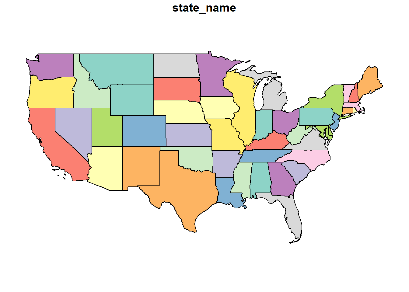 This is the flat map with which most of us are familiar. Latitude and longitude are drawn as parallel lines on this map. The map data are in a shapefile, a format we encountered at the beginning of this course. Let’s look at the top few rows of this shapefile.
## Simple feature collection with 6 features and 1 field
## Geometry type: MULTIPOLYGON
## Dimension:     XY
## Bounding box:  xmin: -124.4096 ymin: 32.53416 xmax: -86.80587 ymax: 49.38436
## Geodetic CRS:  WGS 84
##   state_name                       geometry
## 1 California MULTIPOLYGON (((-118.594 33...
## 2  Wisconsin MULTIPOLYGON (((-86.93428 4...
## 3      Idaho MULTIPOLYGON (((-117.243 44...
## 4  Minnesota MULTIPOLYGON (((-97.22904 4...
## 5       Iowa MULTIPOLYGON (((-96.62187 4...
## 6   Missouri MULTIPOLYGON (((-95.76564 4...
This is a complex dataset, so we will use the Minnesota state boundary as an example. In the map below, there are two objects. The pin in the map represents the map origin. The green dots indicate the Minnesota border.
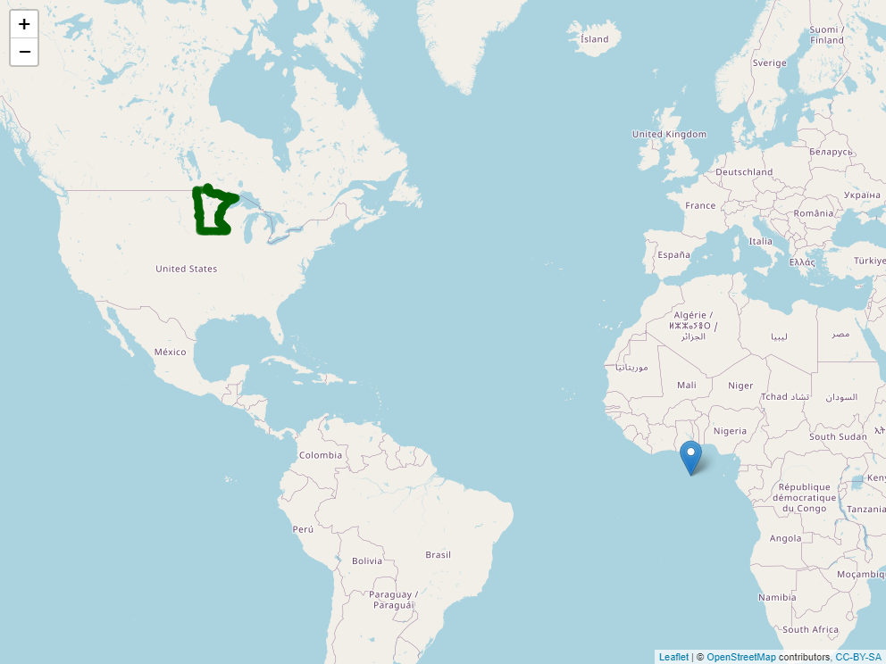
Zoom in on Minnesota and click around its borders. You will notice two things. First, each point is specified in latitude and longitude. Second, longitude (the first number) is always negative while latitude (the second number) is always positive.
The sign and size of geocordinates in a projection system is defined two things: 1) where it places its origin (its reference point for locating objects on the map) and 2) what measurement units it uses. In the case of WGS 84, the origin is the intersection of the Prime Meridian and the Equator. Since all of the continental United States is in the western hemisphere, every state will have a negative longitude and a positive latitude. Since WGS 84 uses angles, the measurement units will be in degrees, which never exceed the range of (-180, 180) for longitude and (-90,90) for latitude.

12.1.2 Mercator (EPSG: 3857)
The Mercator System is commonly used to project data onto a sphere. If you look at the map below, it is very similar (actually related) to the WGS 84 map above but you may be able to see a slight “dome illusion” to the way the map is displayed. This projection is regularly used by online mapping services.
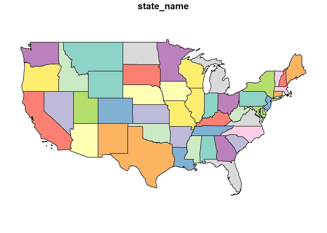
Looking at the top few rows of the Minnesota data points, we can see the units are not latitude and longitude. In this projection, they are easting and northing: measures of the distance east and north of the origin. Easting and northing are usually measured in meters
## Simple feature collection with 6 features and 1 field
## Geometry type: POINT
## Dimension:     XY
## Bounding box:  xmin: -10823490 ymin: 6274648 xmax: -10610960 ymax: 6274978
## Projected CRS: WGS 84 / Pseudo-Mercator
##     state_name                  geometry
## 1    Minnesota POINT (-10823487 6274978)
## 1.1  Minnesota POINT (-10790305 6274859)
## 1.2  Minnesota POINT (-10731801 6274859)
## 1.3  Minnesota POINT (-10683932 6274859)
## 1.4  Minnesota POINT (-10613307 6274648)
## 1.5  Minnesota POINT (-10610961 6274651)
The origin for the Mercator projection is again the intersection of Prime Meridian and Equator, so each Minnesota border point will have a negative value for easting and a positive value for northing.
12.1.3 US National Atlas Equal Area (EPSG: 2163)
As the name suggests, coordinate systems like the US National Atlas Equal Area project data so that the areas of geographic objects are accurate in the map.

This system, like the Mercator above, uses northing and easting units. But whe we look at our Minnesota border coordinates, we now notice our easting vaues are positive! What happened?
## Simple feature collection with 6 features and 1 field
## Geometry type: POINT
## Dimension:     XY
## Bounding box:  xmin: 202876 ymin: 448171.5 xmax: 342482.3 ymax: 454473.8
## Projected CRS: NAD27 / US National Atlas Equal Area
##     state_name                  geometry
## 1    Minnesota   POINT (202876 448171.5)
## 1.1  Minnesota POINT (224686.3 448890.9)
## 1.2  Minnesota POINT (263125.5 450495.2)
## 1.3  Minnesota POINT (294567.2 451996.1)
## 1.4  Minnesota POINT (340942.6 454381.6)
## 1.5  Minnesota POINT (342482.3 454473.8)
As you have likely guessed, our origin has change. For this projection, our origin is in Central South Dakota.

12.1.4 UTM Zone 11N (EPSG: 2955)
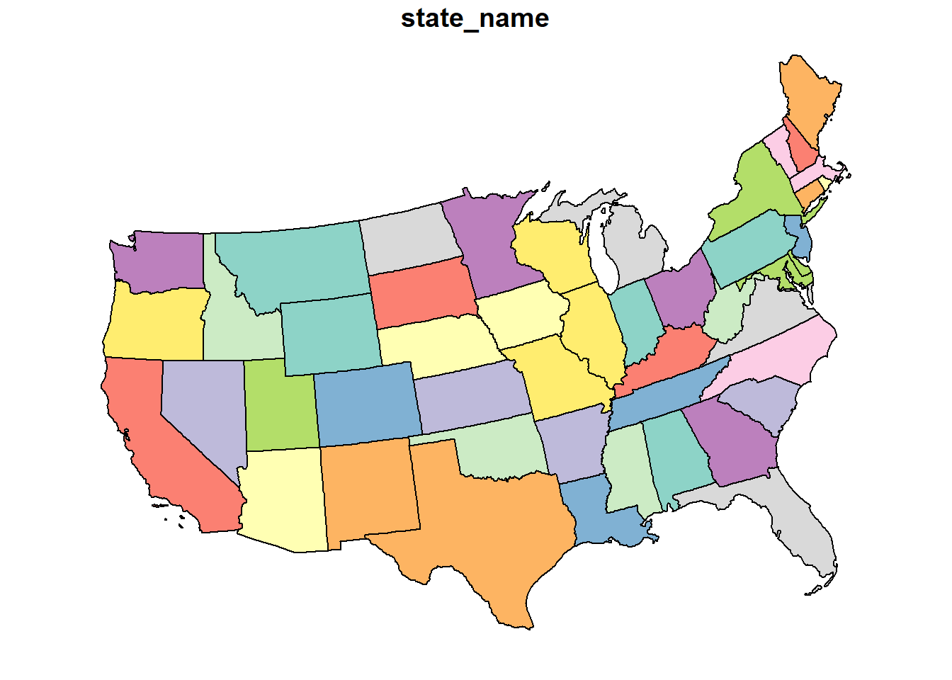
## Simple feature collection with 6 features and 1 field
## Geometry type: MULTIPOLYGON
## Dimension:     XY
## Bounding box:  xmin: -128697 ymin: 3599652 xmax: 3013312 ymax: 5706611
## Projected CRS: NAD83(CSRS) / UTM zone 11N
##   state_name                       geometry
## 1 California MULTIPOLYGON (((351881.3 37...
## 2  Wisconsin MULTIPOLYGON (((2845962 548...
## 3      Idaho MULTIPOLYGON (((480645 4915...
## 4  Minnesota MULTIPOLYGON (((1941564 561...
## 5       Iowa MULTIPOLYGON (((2169056 494...
## 6   Missouri MULTIPOLYGON (((2302630 471...
Here are the coordinates for the Minnesota border again.
## Simple feature collection with 6 features and 1 field
## Geometry type: POINT
## Dimension:     XY
## Bounding box:  xmin: 1941564 ymin: 5618787 xmax: 2079676 ymax: 5658008
## Projected CRS: NAD83(CSRS) / UTM zone 11N
##     state_name                geometry
## 1    Minnesota POINT (1941564 5618787)
## 1.1  Minnesota POINT (1963162 5624612)
## 1.2  Minnesota POINT (2001185 5635247)
## 1.3  Minnesota POINT (2032277 5644167)
## 1.4  Minnesota POINT (2078155 5657549)
## 1.5  Minnesota POINT (2079676 5658008)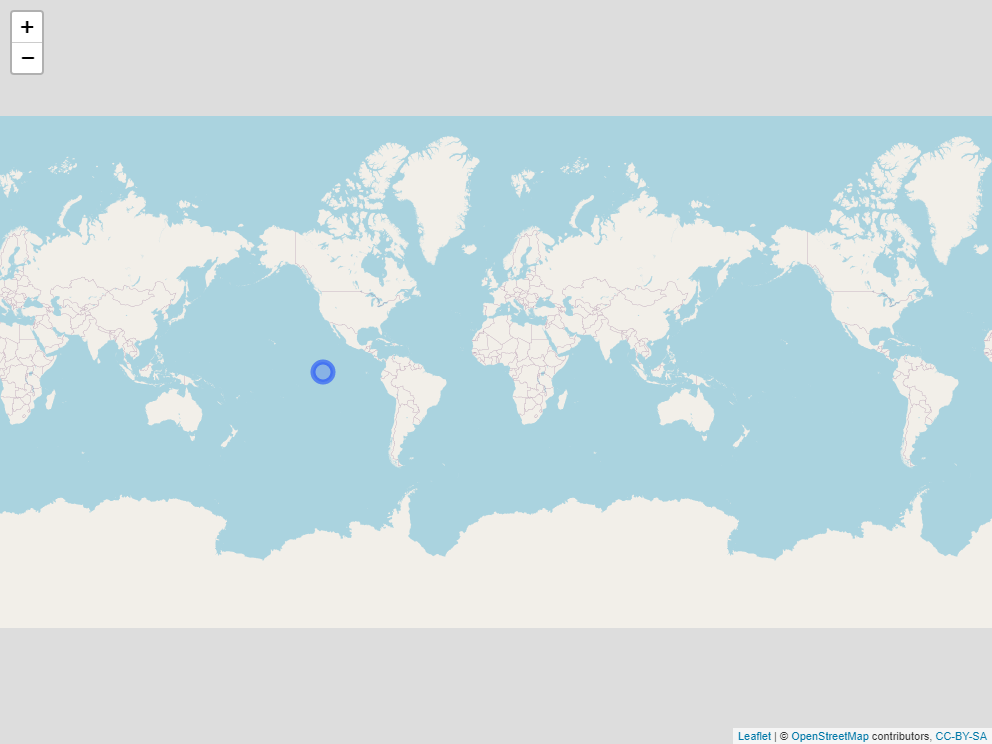
12.1.5 Projection Summary
It is good to know some of these basic projections, but by far the most important concept of this unit is that it is important you are aware of the projection system that accompanies your spatial data. If you are assembing data from multiple shapefiles, as we will do below with soil and yield maps, you will need to account for the projections of each shapefile, to make sure they all have the same projection system.
In addition, different spatial data operations may prefer one projection system over the other. Operations that summarize areas will require projections that are based on area, not geometry. Similarly, spatial tools like rasters (which divide an area into rectangles or squares), will prefer a system that is square.
12.2 Shape Files
12.2.1 Case Study: Soybean Yield in Iowa
This is not our first encounter with shapefiles – we plotted our first shapefile map in the beginning of our course. Let’s return to that dataset!
Let’s examine the first few rows of this shapefile
## Simple feature collection with 6 features and 12 fields
## Geometry type: POINT
## Dimension:     XY
## Bounding box:  xmin: -93.15033 ymin: 41.66641 xmax: -93.15026 ymax: 41.66644
## Geodetic CRS:  WGS 84
##    DISTANCE SWATHWIDTH VRYIELDVOL Crop  WetMass Moisture                 Time
## 1 0.9202733          5   57.38461  174 3443.652     0.00 9/19/2016 4:45:46 PM
## 2 2.6919269          5   55.88097  174 3353.411     0.00 9/19/2016 4:45:48 PM
## 3 2.6263101          5   80.83788  174 4851.075     0.00 9/19/2016 4:45:49 PM
## 4 2.7575437          5   71.76773  174 4306.777     6.22 9/19/2016 4:45:51 PM
## 5 2.3966513          5   91.03274  174 5462.851    12.22 9/19/2016 4:45:54 PM
## 6 3.1840529          5   65.59037  174 3951.056    13.33 9/19/2016 4:45:55 PM
##    Heading VARIETY Elevation                  IsoTime yield_bu
## 1 300.1584   23A42  786.8470 2016-09-19T16:45:46.001Z 65.97034
## 2 303.6084   23A42  786.6140 2016-09-19T16:45:48.004Z 64.24158
## 3 304.3084   23A42  786.1416 2016-09-19T16:45:49.007Z 92.93246
## 4 306.2084   23A42  785.7381 2016-09-19T16:45:51.002Z 77.37348
## 5 309.2284   23A42  785.5937 2016-09-19T16:45:54.002Z 91.86380
## 6 309.7584   23A42  785.7512 2016-09-19T16:45:55.005Z 65.60115
##                     geometry
## 1 POINT (-93.15026 41.66641)
## 2 POINT (-93.15028 41.66641)
## 3 POINT (-93.15028 41.66642)
## 4  POINT (-93.1503 41.66642)
## 5 POINT (-93.15032 41.66644)
## 6 POINT (-93.15033 41.66644)
The most useful shapefiles, in my experience, are presented in the “spatial feature” format above. It is, essentially, a data frame, but with a single, special geometry column that contains multiple measures per row. The geometry column is, if you will, composed of columns within a column.
Let’s ignore the data for now and look at the information (the metadata) at the top of the output. First, let’s note the geometry type is POINT. Each row of this datafile defines one point. Shapefiles can be composed of all sorts of objects: points, lines, polygons, sets of multiple polygons, and so forth – and shapefiles can be converted between formats
Creating a successful map includes telling R what kind of object we intend to draw. So knowing the formate of a shapefile is critical!a helpful starting point.
Second, look at the geographic CRS. CRS stands for Coordinate Reference System. In this case, we are already in the standard WGS 84 format we discussed earler, so our units are latitude and longitude.
One of the things we will learn this lesson is to use Leaflet to create maps. Leaflet is an awesome applet whose true appreciation would require using four-letter conjunctions inappropiate for the classroom. It creates interactive maps that can zoom in, zoom out, and identify the values of individual points.

12.2.2 SSURGO
The Soil Survey Geographic Database (SSURGO) is maintained by the United States Department of Agriculture. It contains extensive soil surveys: soil evaluations for properties, susceptibility to weather extremes, suitability for agriculture, recreation, and buildings. The soil survey used to only be available in county books, which only special libraries had. Now, you can access all these data through R in seconds and match them precisely to a given map location.
The SSURGO data is in a database. A database is a series of tables, all describing different aspects of a data information. Each table contains 1-3 columns that are keys to match the tables with each other. Descriptions of the tables an their data can be obtained for SSURGO at:
https://data.nal.usda.gov/system/files/SSURGO_Metadata_-_Table_Column_Descriptions.pdf
Putting all these tables together can be messy – fortunately, you only need to do it once, after which you can just change the shapefile you feed to the code. I will give you that code in the exercises this week.
Here is a SSURGO map of soil organic matter.
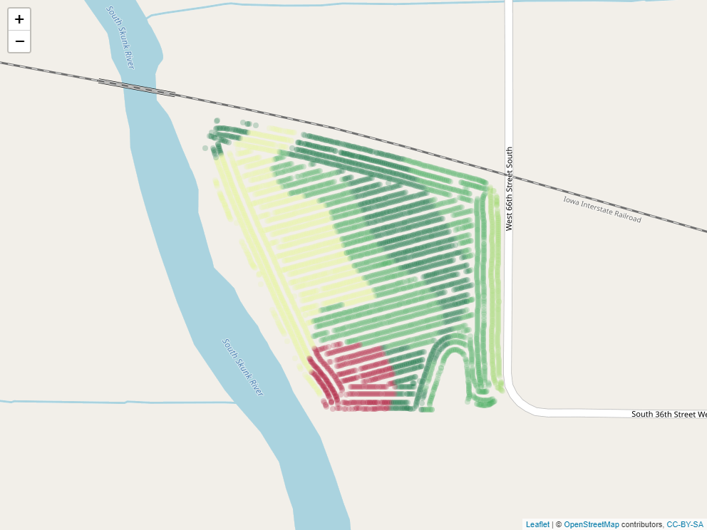
Here is another map, this time with the percent clay.

Now that we have our SSURGO data, we can join it with our yield data and ask questions how yields were grouped by quantitative descriptors, such as soil map unit name (“muname”), texture (“texdesc”), drainage class (“drainagecl”), or parent material (“pmkind”).
##   yield_bu                                 muname hzname sandtotal.r
## 1 65.97034 Wiota silt loam, 0 to 2 percent slopes     H1         9.4
## 2 64.24158 Wiota silt loam, 0 to 2 percent slopes     H1         9.4
## 3 92.93246 Wiota silt loam, 0 to 2 percent slopes     H1         9.4
## 4 77.37348 Wiota silt loam, 0 to 2 percent slopes     H1         9.4
## 5 91.86380 Wiota silt loam, 0 to 2 percent slopes     H1         9.4
## 6 65.60115 Wiota silt loam, 0 to 2 percent slopes     H1         9.4
##   silttotal.r claytotal.r om.r awc.r ksat.r cec7.r    chkey   texdesc
## 1        67.1        23.5    4  0.22      9   22.5 59965160 Silt loam
## 2        67.1        23.5    4  0.22      9   22.5 59965160 Silt loam
## 3        67.1        23.5    4  0.22      9   22.5 59965160 Silt loam
## 4        67.1        23.5    4  0.22      9   22.5 59965160 Silt loam
## 5        67.1        23.5    4  0.22      9   22.5 59965160 Silt loam
## 6        67.1        23.5    4  0.22      9   22.5 59965160 Silt loam
##     drainagecl slope.r   pmkind                   geometry
## 1 Well drained       1 Alluvium POINT (-93.15026 41.66641)
## 2 Well drained       1 Alluvium POINT (-93.15028 41.66641)
## 3 Well drained       1 Alluvium POINT (-93.15028 41.66642)
## 4 Well drained       1 Alluvium  POINT (-93.1503 41.66642)
## 5 Well drained       1 Alluvium POINT (-93.15032 41.66644)
## 6 Well drained       1 Alluvium POINT (-93.15033 41.66644)
For example, here are soybean yields by soil texture, which would suggest a trend where soil yield increased with clay content in this field.
## # A tibble: 4 x 2
##   texdesc         yield_bu
##   <chr>              <dbl>
## 1 Clay loam           81.6
## 2 Silty clay loam     80.7
## 3 Silt loam           79.2
## 4 Loam                78.0
And this table would suggest that soybean preferred poorly drained soil to better-drained soils.
##                drainagecl yield_bu
## 1          Poorly drained 81.32400
## 2            Well drained 78.47489
## 3 Somewhat poorly drained 78.09084
12.2.3 Operations with Shapes
Above, we subsetted our yield data according to different soil properties. In some cases, however, we may want to subset or group data by location.
12.2.3.1 Intersection
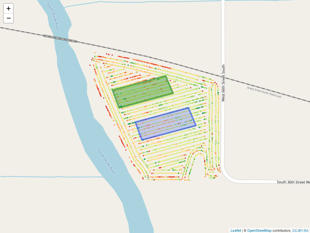
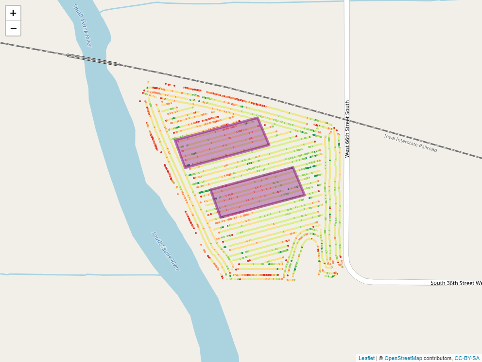
Say, for example, we applied a foliar fertilizer treatment to part of the field, as shown in the map below.
## [1] "temp\\filee002efa391c"
How might we find out statistics for yield measures within that applied area?
## Warning: attribute variables are assumed to be spatially constant throughout all
## geometries
## [1] 79.74649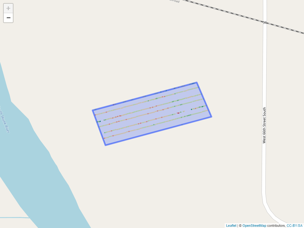
12.3 Rasters
library(stars)

selected_data = point_data %>%
  filter(attribute=="P_bray")

### make grid
grd = st_bbox(boundary) %>%
  st_as_stars() %>%
  st_crop(boundary)
# %>%
  # st_set_crs(6505)


# ordinary kriging --------------------------------------------------------
v = variogram(measure~1, selected_data)
m = fit.variogram(v, vgm("Sph"))
kridge_plot = plot(v, model = m)

lzn.kr1 = gstat::krige(formula = measure~1, selected_data, grd, model=m)
## [using ordinary kriging]# plot(lzn.kr1[1])
library(leafem)
soil_p_map = leaflet(lzn.kr1[1]) %>%
addTiles() %>%
addStarsImage(opacity = 0.5) 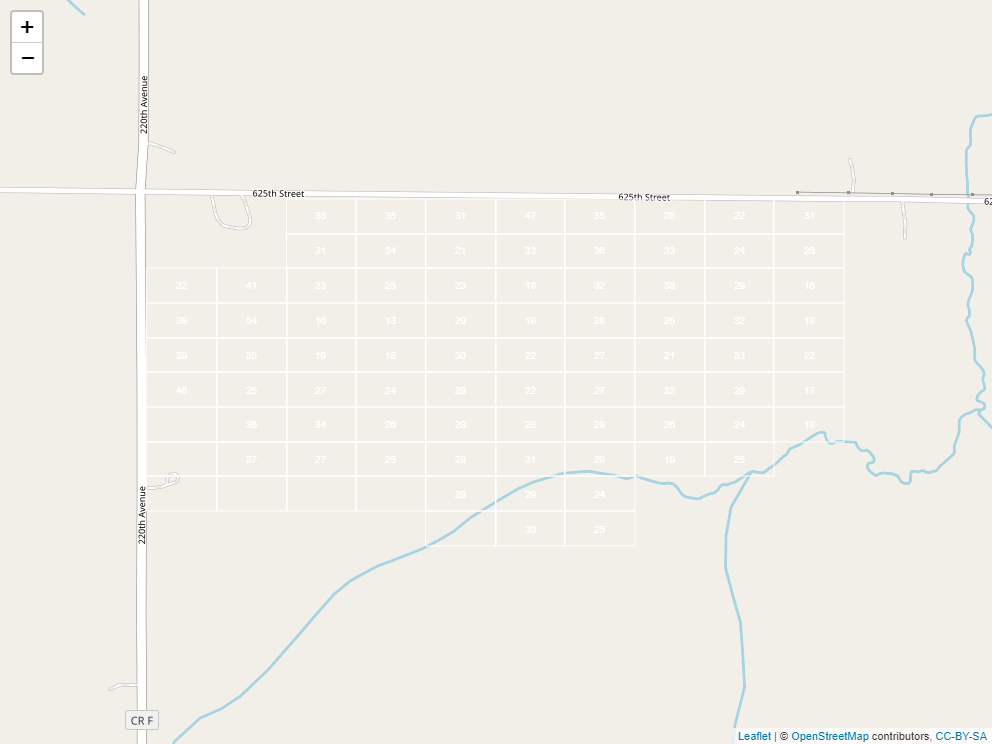
In the previous section, we worked with what are often described as vectors or shapes. That is, points which may or may not have been connected to form lines or polygons.
A raster is a grid system that we use to describe spatial variation. In essence, it is a grid system. Here is the same field we worked with in the previous section, now overlaid with a grid:

If you think it looks a little like we took a spreadsheet and trimmed it to fit our field, you are exactly right. Taking this analogy further, just as a spreadsheet is composed of cells, each containing a different value, so is a raster. Here it is, filled in with values representing predicted soil P test values:
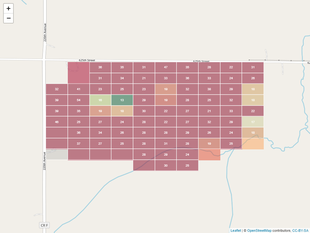
Often, the cells would be colored along a given gradient (say red-yellow-green) according to their values. This helps us to see spatial trends.
12.3.1 Interpolation
To create a raster that represents continuous soil trends across a field, however, we need to do a little modelling. You see, we start out with a set of soil cores like this:
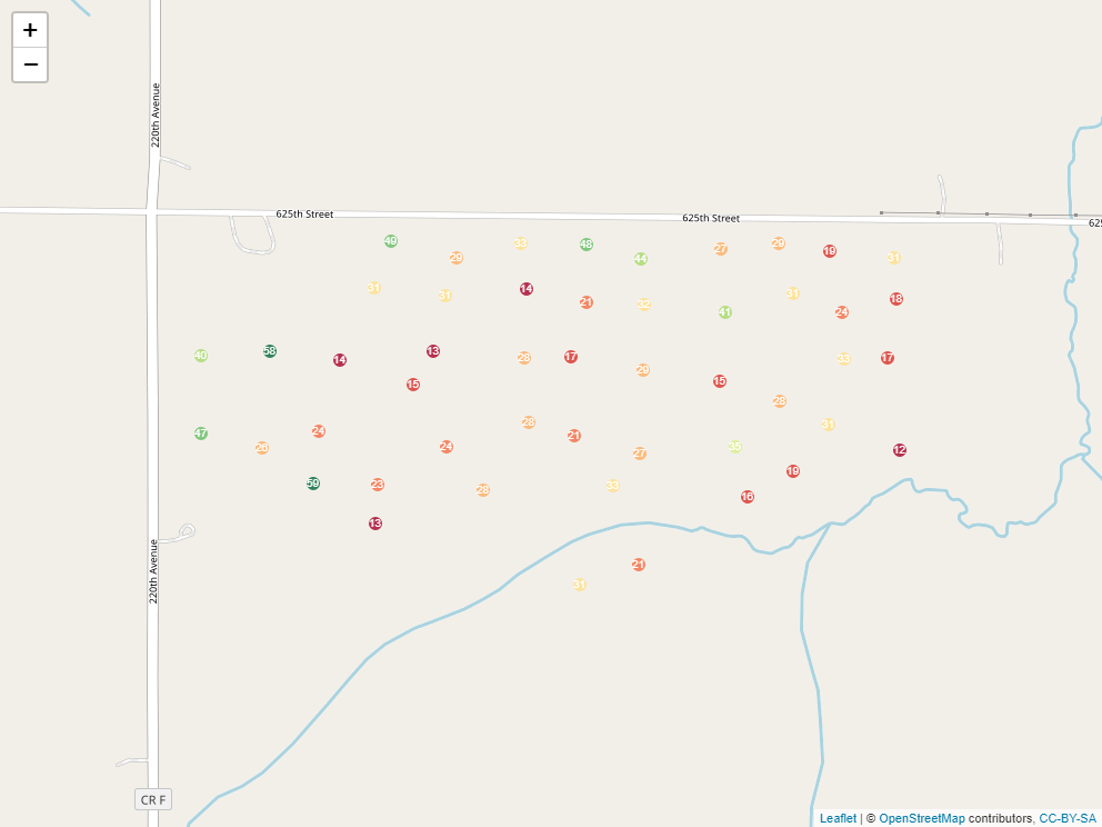
But we are trying to make predictions for each cell of our raster:
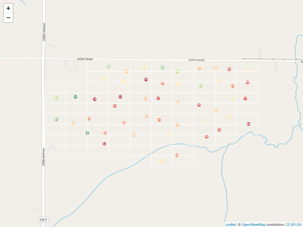 Some cells above one measure, others split a measure with a neighboring cell, and yet others contain no measure at all. In addition, even cells that contain a measure may have it in different locations relative to the cell center.
When we interpolate a raster, we make an educated guess about the values of cells in which no measure was taken, based on the values of the other cells. In the following example, the middle cell is missing:
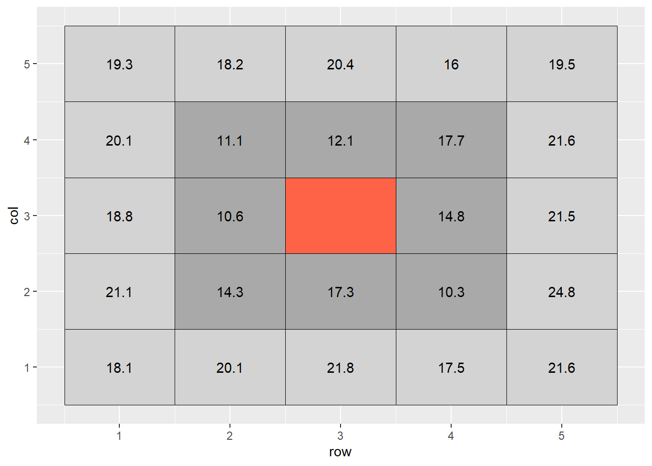
The most basic way to interpolate this missing value would be to estimate it’s value as the mean value of all cells adjacent to it (dark grey in plot above). So the value of the missing cell would be equal to:
\[ \text{cell value} = \text{mean}(16.6, 17.9, 13.1, 19.1, 11.6, 11.1, 16.2, 16.2) = 16.6 \]
If we wanted to be a bit more accurate, we might extend out to the next ring of cells around the cell we are trying to estimate. But we probably would not want them to factor into the mean calculation as much as the first ring of cells – the difference betwen two measurements tends to increase with distance. So if they are two units away from the missing cell of, we might weight them so they contribute 1/4th as much to the estimate as the immediately adjacent cells.
If we were to fill out a table, it would look like this:
## # A tibble: 25 x 6
##      row   col  cell value weight weighted_value
##    <int> <int> <int> <dbl>  <dbl>          <dbl>
##  1     1     1     1  18.1   0.25           4.53
##  2     2     1     2  20.1   0.25           5.03
##  3     3     1     3  21.8   0.25           5.45
##  4     4     1     4  17.5   0.25           4.38
##  5     5     1     5  21.6   0.25           5.4
##  6     1     2     6  21.1   0.25           5.28
##  7     2     2     7  14.3   1             14.3
##  8     3     2     8  17.3   1             17.3
##  9     4     2     9  10.3   1             10.3
## 10     5     2    10  24.8   0.25           6.2
## # ... with 15 more rows
The weighted value for each cell is the product of its observed value times its weight. To calculate the weighted value, we sum the weights and the weighted values. The weighted mean is then:
\[ \text{weighted mean} = \frac{\sum{\text{weighted value}}}{\sum{\text{weight}}} \]
In this example, the calculation would look like:
\[ \text{weighted mean} = \frac{220.45}{13} = 17.0\]
What we have just calculated is called the inverse distance-weighted (IDW) mean of the surrounding points. It is a simple, elegant way to estimate the missing value.
12.3.2 Kriging
The inverse distance-weighted mean, however, is not as accurate as which we are capable. We assume that the influence of points away from the empty cell decreases exponentially with distance. We don’t consider how we would optimally weight the values of the surrounding cells.
We can develop a more complex, but likely accurate, estimate of the cell value using a different interpolation practice called kriging. (For some reason, I always want to insert a “d” into this term so it rhymes with “bridging”. But it is pronounced KREE-ging.) The name comes from Danie Krige, a South African geostatician who was interested in locating gold deposits.
I will take you through the basics of kriging. A more elegant explanation of kriging can be found here: https://pro.arcgis.com/en/pro-app/tool-reference/3d-analyst/how-kriging-works.htm
Kriging evaluates how points of varying differences from each other are correlated. These correlations are plotted in a semivariogram.
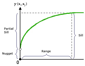
from “How Kriging Works” (https://pro.arcgis.com/en/pro-app/tool-reference/3d-analyst/how-kriging-works.htm)
X is the distance between point pairs. Y is the squared difference between each pair of points selected by the software. Sometimes, pairs will be binned (similar to the binning in histrograms) into according to distance (called “lag”) in this analysis. The squared differences of all pairs within a lag bin are averaged.
Does this nonlinear function look familiar by any chance? That’s right, it is a monomolecular function! The curve is described by different terms to which we are used to (and, to be honest, they don’t always make much sense.) In the kriging curve, the Sill is the maximum value the curve approaches. The Nugget is the y-intercept.
Otherwise, this curve is fit with nonlinear regression, just like the others we have seen. The calculated semivariances are then used to weight observations in calculating the weighted me. In this way, observations are weighted according the the strength of surrounding measurements, according to their measured correlation with distance.
Here is the kridge plot for our soil phosphorus test data.
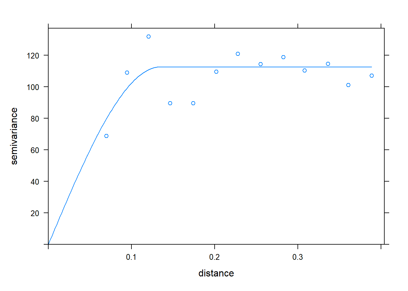 Using this model of the relationship between covariance and distance, then, R can determine how much to weight each observation, based on distance, to estimate values between measurement points.
When we produced our initial raster, the cell size was especially large for simplification of the raster, and to allow the cell values to be shown. When we build a raster with kriging, however, the cell size can be very small. This has the effect of getting rid of blockiness and allowing us to better predict and visualize trends in values across the landscape.
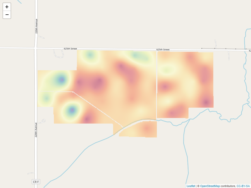
Here is our soil phosphorus test map, interpolated by R, using kriging. The red areas are areas of lower P test values. The green and blue areas have the greatest test values, and the yellow areas are intermediate.
12.3.3 Operations on Kriged Data
Of course, to take this example to completion, we would like to know the P-allication rate for each of the cells within our raster. The University of Minnesota recommended application rate, based on soil P value and yield goal, is:
\[ P _2 O _5 \text{ recommended rate} = [0.700 - .035 (\text{Bray P ppm})] (\text{yield goal}) \]
We can plug each cell’s Bray P test value into this equation. For example, a point with a test value of 17 would, given a yield goal of 200, have a \(P_2O_5\) rate recommendation of:
\[ P _2 O _5 \text{ recommended rate} = [0.700 - .035 (17)] (\text{200}) = 21\]
Here is the rate recommendation map.
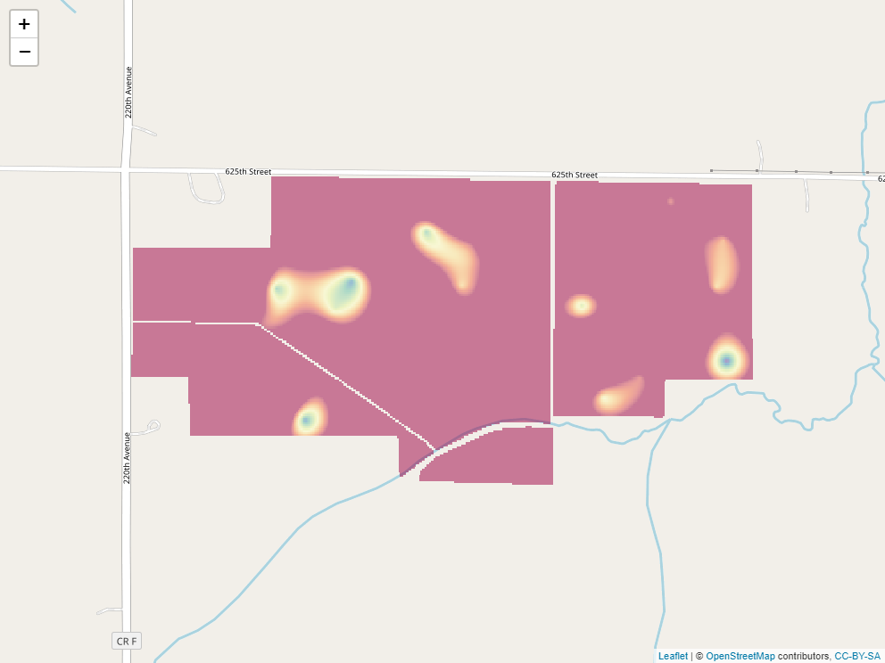
The blue areas now have the highest recommended rates. Yellow are intermediate. Red areas should receive no P fertilizer.


